We make complicated things make sense.
Room 302 is a small studio that builds data visualizations, interactive tools, and prototypes. We've made election graphics for the AP, mapped coral reefs for the Wildlife Conservation Society, and supported a studio member's indie game that ended up in Fast Company.
Hard data, clear stories
We love the moment when a messy dataset clicks into a visualization that actually explains something. That's the work — whether it's global food supply chains or election night results.
Small team, fast hands
We're a small studio on purpose. No layers of approval, no scope creep meetings. You talk to the people building the thing, and we move quickly because we genuinely enjoy the work.
Toolmakers at heart
When we're not doing client work, we're building our own tools — network visualizers, AI assistants, prototyping kits. That instinct to build things that are useful shows up in everything we make.
See the work.
Interactive maps, real-time graphics, tools people actually use. We'd rather show you than tell you about it.
Wildlife Conservation Society
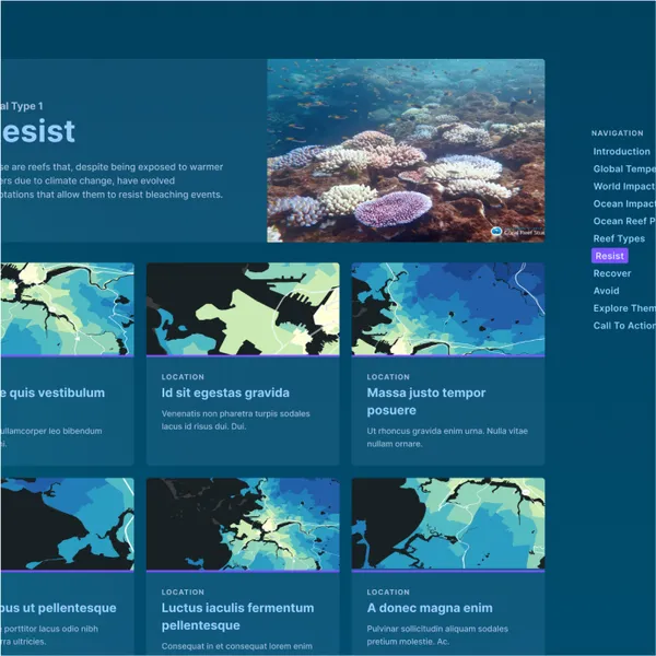
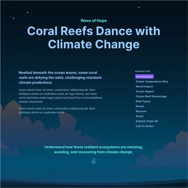
Mapping Resilience
The Wildlife Conservation Society had years of research showing certain coral reefs were surviving climate change better than others. We built interactive maps that let people explore why — launched at NYC Climate Week.
How We Brought This To Life
- Built interactive maps showing which reefs are surviving climate change and why.
- Complex scientific datasets were transformed into accessible visual narratives for policymakers.
- The visualization supported WCS advocacy efforts with clear, actionable insights.
The Plotline
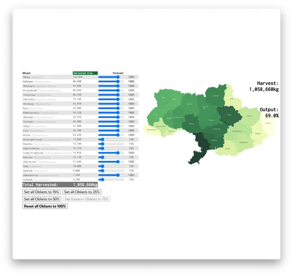
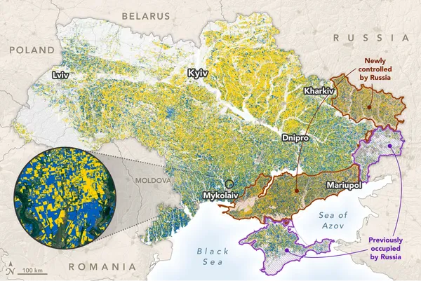
Ukraine Grain
The war in Ukraine was disrupting global grain supply, but the data was scattered and in Ukrainian. We translated it, built an interactive tool where you can adjust output by region, and see the ripple effects on food security worldwide.
How We Brought This To Life
- Against a tight deadline, we rapidly assembled disparate data sources into coherent visualizations.
- We mapped critical supply chain disruptions to illustrate global food security implications.
- The visualization brought clarity to a complex geopolitical situation for key decision-makers.
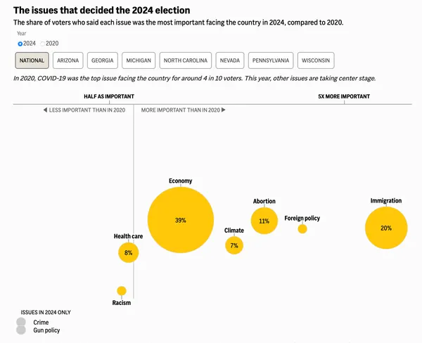
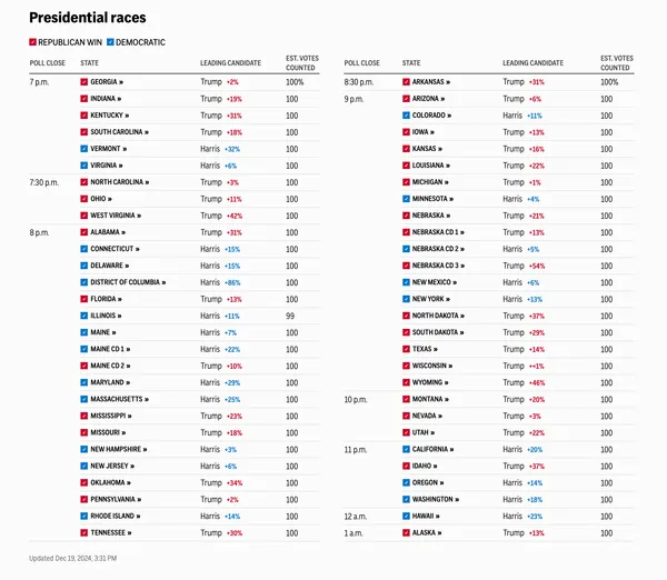
Associated Press
Election 2024
AP needed extra hands for election night. We joined their graphics team to help build and test live election visualizations used by news organizations around the world.
How We Brought This To Life
- Joined AP's existing graphics team and hit the ground running for election night.
- Helped build and QA live graphics under election-night pressure — no room for errors.
- Millions of viewers relied on our visualizations to understand emerging electoral patterns.
Prototyping
Skunkworks for hire
Got an idea that needs to exist? We'll build it with you — working prototypes, not slide decks. You talk directly to the people making the thing.
Data visualization
Make your data land
You've got a dataset that should be telling a story but isn't yet. We build the map, the dashboard, the scrollytelling piece — whatever makes people actually get it.
Ready to collaborate?
We'd love to hear what you're working on.
or email us directly at [email protected]
Building elegant utilities for good.
Data-Driven Process
Data is at the center of everything we build. We prototype fast, test with real users, and let the results guide what we make.
Fearless Experimentation
The future is for the bold. We embrace the unknown, pioneering new paths and designing new futures. We are at home exploring things no one has ever seen before.
Emphasizing Collaboration
Our online space emphasizes collaboration, where like-minded people can gather and turn their ideas into reality through the power of collective creativity.